

I have spent hours trying to get AI to generate a decent logo. Sometimes the result looked like clip art from 2003. Other times, it was surprisingly close to something a professional designer might charge $500 for. The difference was never the tool. It was always the prompt.
If you have been using Google’s Gemini AI and wondering why your logo results feel flat or generic, you are not alone. Most people type something like “make me a logo for my coffee shop” and then wonder why it looks like a stock image. That is not a Gemini problem. That is a prompting problem — and it is completely fixable.
This guide walks you through everything you need to know about writing a great prompt for Gemini AI logos. You will get 17 real, copy-paste-ready prompts, a breakdown of every element that makes a prompt work
What Makes a Good Prompt for Gemini AI Logos?
A good prompt for Gemini AI logos is specific, visual, and structured around five core elements: style, color, industry, mood, and composition. When you include all five, Gemini has enough context to generate something that actually looks intentional — not random.
This is the foundation of prompt engineering for logo design. Think of your prompt like a creative brief you would hand to a freelance designer. The more detailed and directional that the brief is, the less time you spend in revisions.
Here is what each of those five elements means in practice:
- Style — This tells Gemini what the logo should look like visually. Words like “flat design,” “minimalist,” “vintage hand-drawn,” “geometric,” or “badge-style” guide the overall aesthetic. Without this, Gemini defaults to something generic. If your brand is a modern tech startup, you want flat design with clean lines. If you run a craft brewery, you probably want something with a vintage, textured feel. Do not just say “modern” — say “modern flat vector style with sharp edges.” The more precise your style descriptor, the more accurate your AI-generated logo output becomes.
- Color — Colors carry meaning, and they carry weight in logo prompt engineering. Deep navy signals trust and professionalism. Bright orange signals energy and creativity. Earthy greens signal nature and sustainability. Tell Gemini exactly which colors you want — hex codes work if you use them, but even descriptive phrases like “muted sage green and off-white” give it enough direction. Avoid just saying “blue” or “green.” The more precise you are, the better the color palette AI output becomes.
- Industry — Context matters enormously in AI logo design. A logo for a law firm looks nothing like a logo for a children’s clothing brand. Your prompt should name your industry or niche clearly. Say “cybersecurity company,” “artisan bakery,” “luxury skincare brand,” or “fitness coaching app.” This single phrase shifts the entire semantic direction of what Gemini generates.
- Mood/Tone — Think about how you want people to feel when they see your logo. Confident? Playful? Trustworthy? Edgy? Calm? This is the emotional layer of your prompt. Phrases like “professional and approachable,” “bold and aggressive,” “calm and minimalist,” or “fun and youthful” help Gemini adjust the visual energy of the result. Mood is the emotional filter that sits over every other decision in the logo generation process.
- Composition — Do you want a wordmark (just text)? An icon only? A combination mark (icon plus text)? A badge or emblem shape? Should the icon sit to the left of the text or above it? Gemini can follow these layout instructions if you give them clearly. Without composition guidance, you get whatever the model decides, which may not fit your use case at all.
When you combine all five of these, your prompt transforms from “make me a logo” into a real AI creative brief that Gemini can execute with precision.
Why Do Most Gemini Logo Prompts Fail?
Most Gemini logo prompts fail because they are too vague to give the model enough direction. Gemini is a powerful multimodal AI, but it cannot read your mind. Vague input produces vague output. That is not a flaw in the technology — it is a prompting gap that you can close.
Here is a side-by-side comparison of a weak prompt versus a strong one:
| Element | Weak Prompt | Strong Prompt |
|---|---|---|
| Style | Not mentioned | Flat vector design, minimalist |
| Color | Not mentioned | Navy blue (#1B2A4A) and gold (#C8A951) |
| Industry | “My business” | Wealth management firm |
| Mood | Not mentioned | Professional, trustworthy, sophisticated |
| Composition | Not mentioned | Icon above wordmark, circular badge format |
| Text | “Company name” | No text, icon only |
| Background | Not mentioned | Clean white background, scalable logo style |
The weak prompt gives Gemini nothing to anchor its visual decisions. The strong prompt functions like a structured creative brief — and Gemini responds to structured briefs exceptionally well.
Another common mistake is asking Gemini to “generate a logo” without specifying that you want a vector-style, clean-background image. Without that guidance, the model may add photographic textures, complex gradients, or illustrative backgrounds that make the logo output unusable for actual branding.
How Do You Structure a Gemini AI Logo Prompt Step by Step?
You structure a Gemini AI logo prompt by following a clear sentence formula that stacks visual descriptors in a logical order. Think of it like building a creative sandwich — each layer adds definition, and the order matters.
Here is the logo prompt formula I use consistently:
[Logo type] for a [industry/niche], [style descriptor], [color palette], [mood/tone], [composition details], [background], [specific symbols or icons].
Let me walk you through each part of that formula in detail, because understanding the logic behind each step is what separates a mediocre AI logo result from a genuinely useful one:
- Logo type first — Open with “A minimalist logo,” “A vintage badge logo,” or “A geometric icon.” This sets the visual frame immediately. Gemini anchors everything else — color, style, mood, composition — to this opening descriptor. Get this wrong and the rest of your prompt fights against it.
- Name the industry — Follow immediately with “for a [industry].” This is perhaps the single most important element in the entire prompt. Writing “for a sustainable clothing brand” versus “for a tech company” completely changes the visual language, symbol library, and typographic direction Gemini draws from.
- Add your style descriptor — Say exactly how the logo should look: “flat vector illustration,” “hand-drawn with ink texture,” “bold geometric shapes,” “art deco typography.” Pair two compatible descriptors when possible for more precision, like “clean minimalist with subtle gradient accents” or “vintage hand-drawn with modern color palette.”
- State the color palette — Be specific with your color instructions. “Warm terracotta, cream white, and deep forest green” is far better than “earthy tones.” If you know your exact hex codes, include them — Gemini processes them accurately. This is especially important for brand identity design where color consistency matters.
- Define the mood — One or two adjectives are enough here. “Professional and clean,” “bold and energetic,” “soft and nurturing,” “edgy and modern.” These act as an emotional filter on every visual decision Gemini makes within the logo generation process.
- Describe the composition — Tell Gemini the exact layout. Icon only? Icon with text below? Circular emblem? Horizontal combination mark? This prevents the model from making structural decisions you might not like — and composition determines whether a logo works across different use cases like business cards, websites, and merchandise.
- Specify the background — Always add “on a clean white background” or “transparent background” unless you want something different. This single instruction makes your AI logo output immediately usable. Without it, Gemini sometimes places the logo on contextual backgrounds that are impossible to remove cleanly.
- Mention specific visual elements — If your brand uses a specific symbol — a leaf, a lion, a mountain, a circuit board, a lotus — name it explicitly. Do not assume Gemini will guess it. Write “featuring a minimalist mountain icon” or “with a stylized fox silhouette.” Explicit entity mentions produce far more accurate results in text-to-image logo generation.
17 Ready-to-Use Prompts for Gemini AI Logos
These are 17 fully written, industry-specific prompts you can copy and use directly with Gemini. Each one follows the formula above and includes a full explanation of why the prompt is structured the way it is — so you understand the logic and can adapt it confidently to your own brand.
1. Tech Startup Logo Prompt
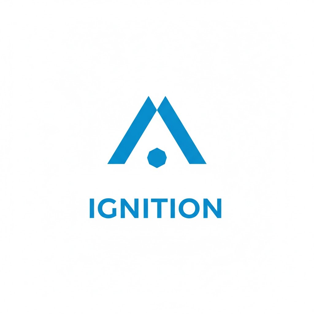
Prompt: “A minimalist flat vector logo for a SaaS technology startup, featuring a geometric abstract icon made of overlapping triangles, color palette of electric blue (#2C6BED) and white, professional and innovative mood, icon centered above a clean sans-serif wordmark, white background, scalable logo style.”
This prompt works because it communicates the two things that matter most for tech brand identity design: clean geometry and professional confidence. The overlapping triangles suggest connection, growth, and forward motion — all values a SaaS brand wants to project. Electric blue is one of the most trusted colors in the technology sector, used by brands like PayPal, Dell, and Samsung for precisely that reason. Specifying “sans-serif wordmark” keeps the typography modern and digitally readable. If you want to personalize this further, replace “electric blue” with your specific brand hex code. The combination mark format (icon above wordmark) scales cleanly from app icon to pitch deck.
2. Artisan Bakery Logo Prompt
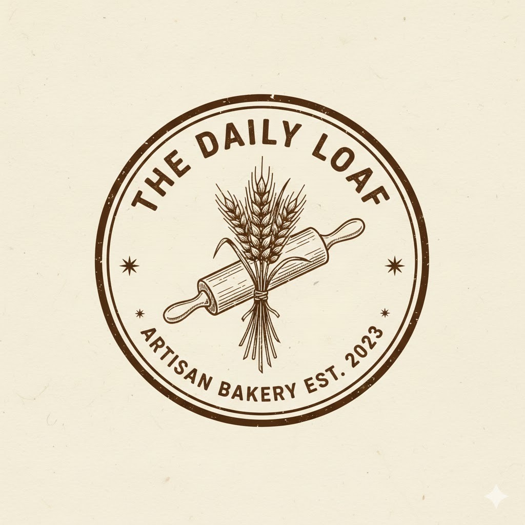
Prompt: “A hand-drawn vintage badge logo for an artisan bakery, featuring a wheat stalk and rolling pin illustration, warm cream (#F5F0E8) and dark brown (#3B2314) color palette, rustic and welcoming mood, circular badge format with the bakery name along the border, off-white background.”
The vintage badge format is one of the most effective logo compositions for food and craft businesses because it communicates heritage and authenticity at a glance. Specifying “hand-drawn” tells Gemini to introduce organic, imperfect linework rather than perfect vector shapes — which is exactly right for a brand built on craftsmanship and human skill. Wheat and rolling pin are strong visual entities for a bakery because they are immediately recognizable and industry-specific without being clichéd. The circular badge with name along the border is a classic composition that works beautifully on packaging, sticker labels, bread bags, and shop signage alike.
3. Luxury Skincare Brand Logo Prompt

Prompt: “An elegant minimalist wordmark logo for a luxury skincare brand, featuring delicate serif typography with a thin botanical leaf accent line, soft rose gold (#C4956A) and ivory white (#FAF7F2), sophisticated and refined mood, horizontal layout, clean white background, no illustration — typography-focused only.”
For luxury brands, restraint is always the right visual strategy. This prompt deliberately removes a complex icon and focuses everything on typography and a single delicate botanical accent. Rose gold is a sophisticated color that sits firmly in the premium beauty market — used by brands like Glossier and Charlotte Tilbury for its warmth and femininity without loudness. The thin botanical leaf accent adds just enough visual interest without cluttering the design. If you are building a luxury skincare brand identity, this prompt gives Gemini strong semantic anchors for the high-end beauty market while keeping the output clean enough to use directly.
4. Fitness Coaching App Logo Prompt
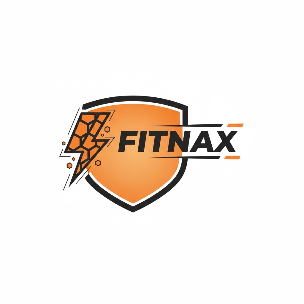
Prompt: “A bold geometric icon logo for a fitness coaching mobile app, featuring an abstract lightning bolt shape formed from angular hexagons, vivid orange (#FF5A1F) and charcoal black (#1C1C1C), high-energy and motivating mood, icon-only format, white background, flat vector illustration style.” (YOU CAN ADD TEXT OR YOUR BRAND NAME)
Energy, speed, and transformation — that is what every element of this prompt communicates. The lightning bolt is a powerful symbol for performance and change, which is why it appears so consistently in fitness branding. Specifying “angular hexagons” moves the bolt away from generic clip art territory into something with a modern, app-ready geometric quality. Vivid orange is clinically associated with energy and action — brands like Nike and Gatorade leverage it precisely for this psychological association. The icon-only format is smart for a mobile app because app store icons must work in a small square space without any accompanying text.
5. Sustainable Fashion Brand Logo Prompt

Prompt: “A clean modern logo for a sustainable fashion brand, featuring a minimalist leaf integrated into the letter ‘S,’ muted sage green (#7FAF7B) and off-white (#F8F6F0), eco-conscious and modern mood, icon combined with clean lowercase wordmark to the right, white background, flat design.”
Integrating a leaf into a letterform is a classic brand identity technique that communicates the brand’s values without being heavy-handed or preachy. The muted sage green palette is important here — it says “sustainable” without aggressively shouting it, which is exactly the tone most modern eco-conscious fashion brands want. Lowercase typography signals approachability and contemporary values. The combination mark format (icon plus wordmark) is the most versatile logo structure for a fashion brand because it scales cleanly across hang tags, website headers, social media profiles, and garment labels.
6. Law Firm Logo Prompt
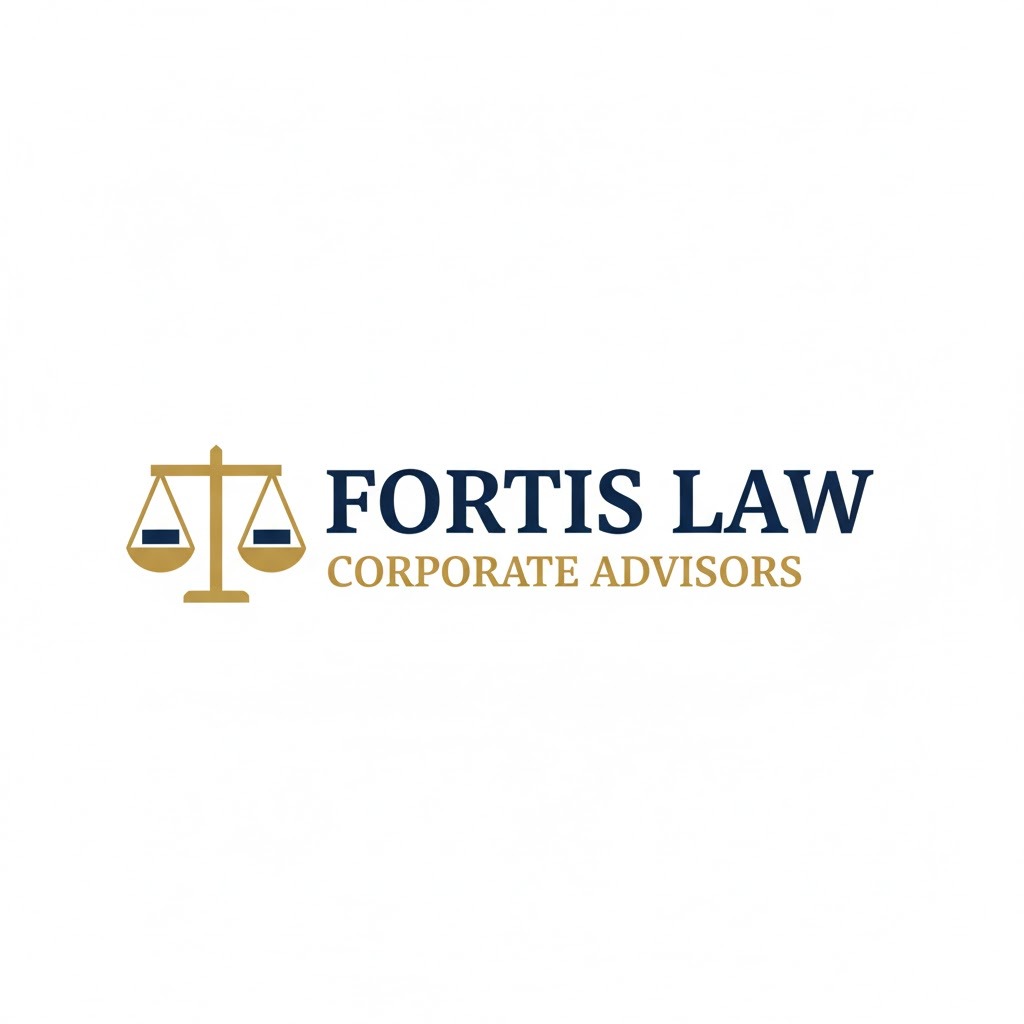
Prompt: “A professional classic logo for a corporate law firm, featuring a balanced scale icon with clean geometric lines, deep navy blue (#1B2A4A) and gold (#C8A951) color palette, authoritative and trustworthy mood, icon to the left of bold serif typography, white background, no gradients.”
Navy and gold is one of the most established color combinations in legal brand identity design — and it holds that position because it works. Navy communicates stability, authority, and trust. Gold communicates prestige and professional excellence. Together they say exactly what a law firm needs to communicate without ambiguity. The balanced scale is the defining visual entity in legal branding — it signals justice and fairness instantly. Specifying “bold serif typography” is critical here because serif fonts carry an inherent sense of tradition and established authority that no sans-serif can replicate in a legal context.
7. Coffee Shop Logo Prompt

Prompt: “A warm illustrated logo for an independent coffee shop, featuring a minimalist coffee cup with steam rising in a simple curved line, deep espresso brown (#3C1F0F) and amber (#D4822A), cozy and inviting mood, circular stamp format with cafe name around the edge, cream background.”
The circular stamp format is one of the most effective compositions for independent food and beverage brands because it feels artisanal and handcrafted — which is exactly the positioning an independent coffee shop needs to differentiate itself from chain competitors like Starbucks and Dunkin’. The steam rising as a single curved line is a minimalist design decision that keeps the icon clean and scalable while still communicating warmth and freshness. Espresso brown and amber are thematically appropriate, but more importantly, they are genuinely warm colors that trigger positive psychological associations with comfort, quality, and a good morning.
8. Cybersecurity Company Logo Prompt

Prompt: “A sleek modern logo for a cybersecurity firm, featuring a shield icon with a circuit board pattern inside it, dark charcoal (#0D0D0D) and neon green (#39FF14), secure and cutting-edge mood, icon above bold uppercase sans-serif wordmark, dark background, tech-style flat vector art.”
The shield is the most semantically loaded icon in cybersecurity branding — it instantly communicates protection without requiring any supporting explanation. Layering a circuit board pattern inside the shield bridges the security metaphor with the technology context in a single elegant mark. Neon green on near-black is a color combination with deep roots in hacker and tech culture — it signals digital expertise and cutting-edge capability that resonates with the target audience of IT decision-makers and enterprise security buyers. Bold uppercase typography reinforces confidence and authority. This prompt works across cybersecurity, network security, data protection, and IT services branding.
9. Children’s Education App Logo Prompt

Prompt: “A playful colorful logo for a children’s learning app, featuring a smiling open book with a graduation cap, bright yellow (#FFD600), sky blue (#5BC8F5), and coral red (#FF6B6B) palette, fun and friendly mood, cartoon rounded style, white background, no text — icon only.”
Every decision in this prompt is designed to appeal to two audiences simultaneously: children, who respond to bright colors, rounded shapes, and expressive characters, and parents, who respond to quality signals like the graduation cap and the organized, non-chaotic color palette. The three-color system of yellow, sky blue, and coral red is a classic primary-adjacent combination that reads as energetic, inclusive, and accessible. Rounded cartoon-style shapes are critical for children’s branding because sharp geometric edges carry an unintended coldness. The icon-only format ensures the mark works perfectly as a small square app store icon.
10. Yoga and Wellness Studio Logo Prompt

Prompt: “A serene minimalist logo for a yoga and wellness studio, featuring a lotus flower formed from simple curved lines, dusty mauve (#B07C8E) and sage white (#F5F3EE), calm and healing mood, icon above a thin lightweight serif wordmark, white background, hand-drawn line art style.”
The lotus flower is one of the most meaningful visual symbols in wellness and mindfulness branding — representing transformation, purity, and inner peace across multiple cultures. Rendering it in simple curved lines rather than a detailed botanical illustration keeps the logo clean, versatile, and appropriately abstract. Dusty mauve is a sophisticated, calming color that sits in the same emotional register as lavender and rose — it signals femininity, healing, and inner calm without being aggressively pink or overly soft. The thin lightweight serif wordmark adds refinement without competing with the icon for visual attention. This prompt is built for yoga studios, meditation apps, and holistic wellness coaches.
11. Craft Beer Brewery Logo Prompt
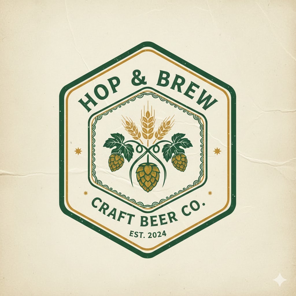
Prompt: “A bold vintage logo for a craft beer brewery, featuring a hop plant and barley grain illustration inside a hexagonal frame, amber gold (#E5A020) and dark forest green (#1B3A2D), hearty and authentic mood, emblem badge format, aged parchment texture background, hand-lettered typography.”
The hexagonal frame is a signature composition in craft beer logo design — its honeycomb association connects naturally to natural ingredients, manual production processes, and community values. Hop and barley are the two most recognizable visual entities in the brewing industry and their inclusion signals authenticity and real craft expertise immediately to the target audience. Amber gold and dark forest green reads as rich, natural, and premium — a color pairing used extensively by craft brands that want to communicate quality without cold corporate aesthetics. Hand-lettered typography adds a human character that no digital font can fully replicate, which is exactly the emotional tone independent craft breweries want to project.
12. Real Estate Agency Logo Prompt

Prompt: “A clean professional logo for a luxury real estate agency, featuring a minimalist house icon with a geometric key integrated into the roofline, warm charcoal (#2D2D2D) and champagne gold (#C9A84C), elegant and trustworthy mood, icon to the left of a modern serif wordmark, white background.”
Integrating the key into the roofline of the house icon is a single-element solution that communicates two core ideas simultaneously — home and access, ownership and opportunity — without requiring two separate visual elements that would clutter the design. Champagne gold sits in a distinctly different tier from regular gold; it is warmer and softer, making it appropriate for a luxury positioning that feels welcoming rather than cold or intimidating. Warm charcoal rather than stark black softens the overall feel while maintaining the professional authority the real estate market demands. The horizontal combination mark composition is the industry standard for real estate branding because it reads consistently across business cards, yard signs, and website headers.
13. Music Production Studio Logo Prompt

Prompt: “A modern abstract logo for a music production studio, featuring a sound wave that forms the shape of a speaker, deep purple (#2D1B5E) and electric violet (#9B5DE5), creative and professional mood, icon-only circular format, dark navy background, neon glow effect on the wave shape. Add Text MUSICYA”
The sound wave as a visual entity is a strong prompt choice for a music brand because it is both abstract and immediately industry-specific. Shaping the wave into a speaker silhouette layers two recognizable industry symbols into one elegant mark that tells the brand’s story without words. Deep purple and electric violet are colors strongly associated with creativity, premium artistry, and digital production — they appear consistently in music production, DJ culture, and recording studio branding because they feel both sophisticated and energetic. The neon glow effect adds a contemporary, high-energy quality that positions the studio as forward-looking. The dark navy background amplifies the vibrant colors for maximum visual impact.
14. Pet Care Brand Logo Prompt
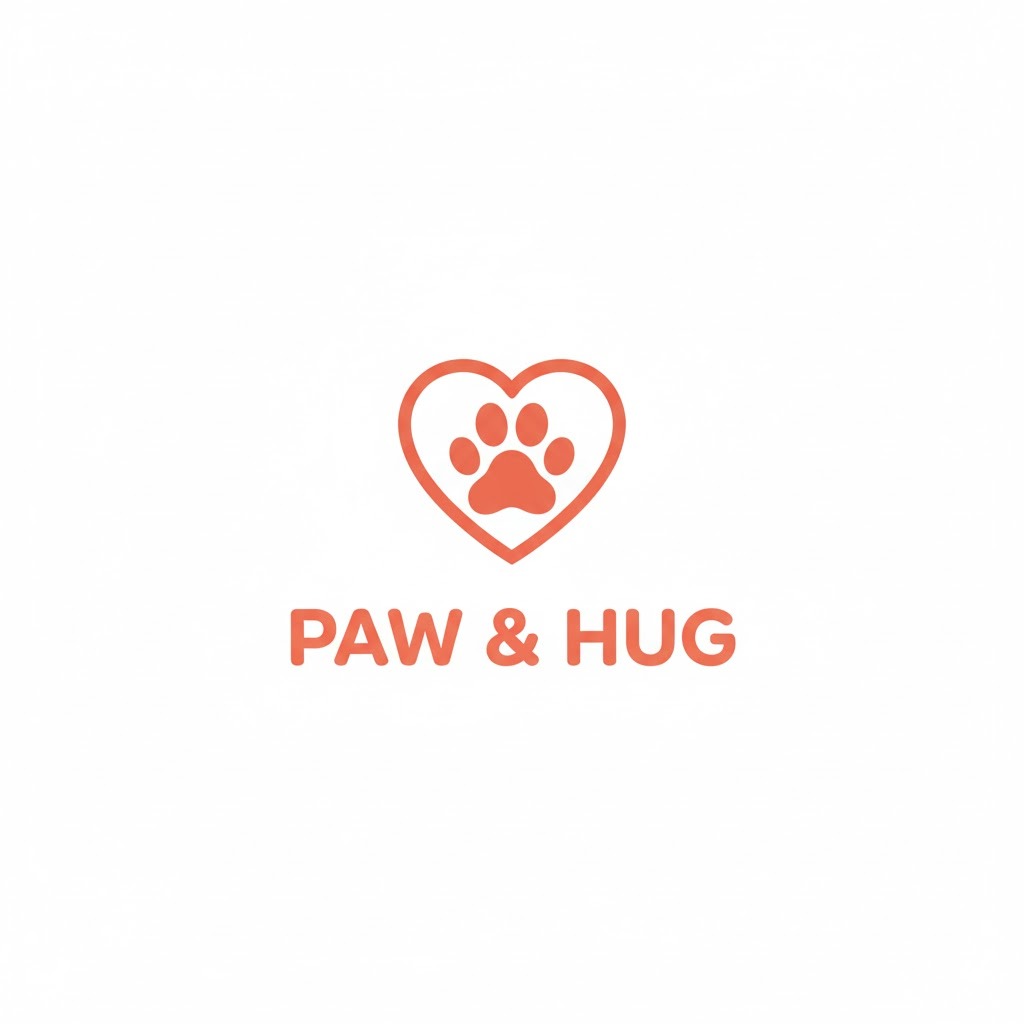
Prompt: “A friendly illustrated logo for a pet care brand, featuring a minimalist dog paw print inside a heart shape, warm coral (#FF6F61) and soft cream (#FFF5EC), caring and approachable mood, icon above a rounded friendly sans-serif wordmark, white background, flat vector design.”
The paw-inside-heart composition is one of the most emotionally resonant icon combinations in the pet care industry because it directly communicates love and care — which is the fundamental emotional promise any pet care brand needs to make to its audience. Warm coral sits at the intersection of warmth, energy, and affection — it is friendlier and more approachable than red and more engaging than soft pink. Rounded sans-serif typography mirrors the rounded, friendly character of the icon and keeps the entire identity visually cohesive and consistent. This prompt works effectively for pet sitting services, veterinary brands, pet food companies, dog training coaches, and animal shelter organizations.
15. Travel Agency Logo Prompt
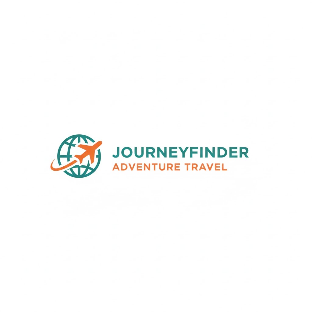
Prompt: “A dynamic modern logo for a boutique travel agency, featuring a stylized globe with a plane silhouette as an orbit line, ocean teal (#00948A) and sunset orange (#FF7940), adventurous and inspiring mood, icon to the left of clean sans-serif wordmark, white background, flat minimal vector style.”
Using the plane as the orbit line around the globe is an elegant single-element solution that communicates both travel and the world without visual clutter or two competing icons. Ocean teal and sunset orange is a color pairing that works as implicit destination storytelling — turquoise water and golden sunsets are the two most universal visual promises of travel. The horizontal combination mark is the professional standard for service businesses because it reads cleanly at every scale from website header to business card. Including “boutique” in the prompt steers Gemini away from generic mass-market travel iconography toward something more refined and high-end.
16. Financial Planning Brand Logo Prompt
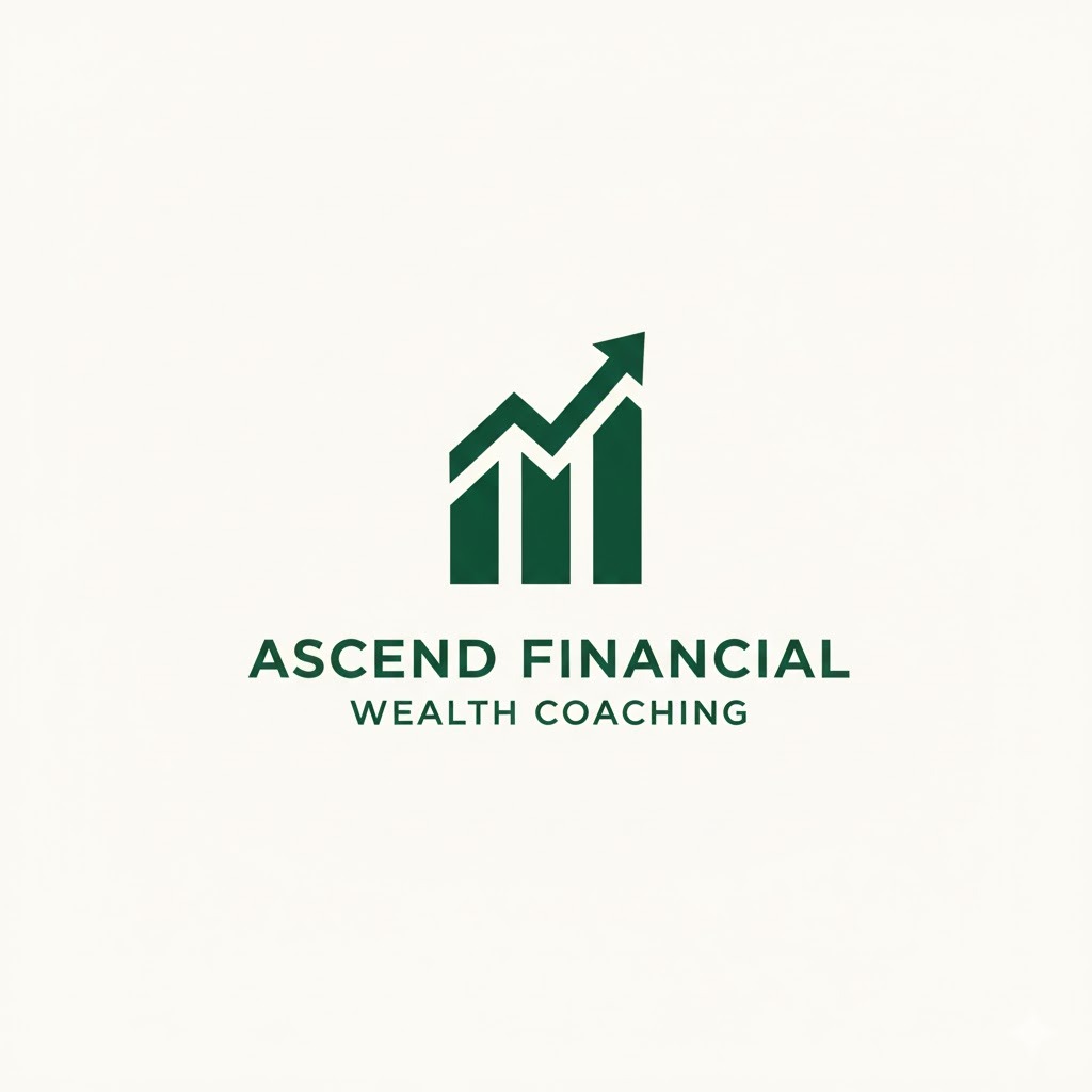
Prompt: “A sophisticated minimal logo for a personal finance coaching brand, featuring an upward-trending arrow integrated into a clean bar chart, deep emerald green (#1A4D3C) and warm white (#FAFAF8), trustworthy and growth-oriented mood, icon above a modern clean wordmark, white background, flat design no gradients.”
The upward arrow integrated into a bar chart is a composed icon that communicates financial growth and positive trajectory without relying on tired money symbols like dollar signs or coins. Emerald green carries strong associations with prosperity, money, and positive growth — and it avoids the cold corporate feeling of navy-only palettes that dominate the financial sector. Warm white rather than stark clinical white keeps the overall feel approachable and human, which matters specifically for a personal finance coaching brand where the client relationship is the product. Specifying “no gradients” keeps the output production-ready for both digital and print applications.
17. Photography Studio Logo Prompt
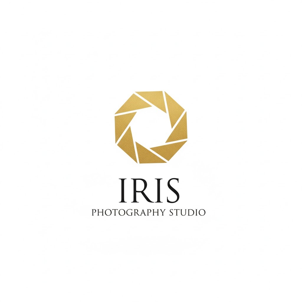
Prompt: “An elegant modern logo for a professional photography studio, featuring a minimalist camera aperture icon made from six symmetrical lines forming a circle, matte black (#1A1A1A) and brushed gold (#C8A85C), professional and artistic mood, icon centered above a lightweight serif wordmark, white background, clean vector art.”
The aperture icon is the defining visual entity of photography branding — but specifying “six symmetrical lines forming a circle” moves it entirely away from clip art territory into something geometric, intentional, and premium. Matte black and brushed gold communicates high-end professional work — the same palette that appears in luxury portrait studios and fine art photography brands. Lightweight serif typography adds artistic refinement that heavier bolder fonts cannot achieve in this context. The centered stacked composition (icon above wordmark) works exceptionally well for photography brands because it mirrors the symmetry and visual balance that professional photography itself demands as a craft.
How Do You Refine Your Gemini Logo Results?
You refine your Gemini logo results by iterating on your prompt with targeted, specific adjustments rather than starting from scratch each time. Think of it like giving design feedback to a creative partner — you build on what works and correct what does not.
Here is how I approach the refinement process in AI logo generation:
- Isolate the problem before changing anything. If the icon composition looks right but the color palette is off, only adjust the color section of your prompt. Changing multiple elements at once makes it impossible to know what fixed — or broke — the output. Treat each revision as a controlled experiment.
- Use directional language like “more” and “less.” Phrases like “more geometric,” “less cluttered,” “simpler linework,” “bolder typography,” or “less saturated color palette” give Gemini a clear direction without resetting the entire design concept from scratch.
- Add explicit “do not include” instructions. If Gemini keeps adding text when you want an icon only, explicitly add “no text, no wordmark, icon only” to your prompt. Negative constraints work powerfully in text-to-image prompting and are often more effective than trying to describe what you want more precisely.
- Request variations explicitly. Ask Gemini to “generate three variations of the same concept with different compositions” to explore layout options quickly without rebuilding your core prompt from the beginning.
- Break complex logos into focused parts. If you want an intricate emblem with detailed illustration, describe the icon in one focused prompt first, then describe the typography treatment separately. Combining the strongest elements from different outputs gives you far more precise creative control than trying to describe everything in one long prompt.
Gemini AI Logo Prompts vs. Other AI Logo Tools
Gemini AI logo prompts compare favorably to competing tools in flexibility and creative range, but each platform has distinct strengths depending on your workflow and output requirements.
| Tool | Strengths | Weaknesses | Best For |
|---|---|---|---|
| Gemini AI | Flexible prompting, Google ecosystem integration, multimodal context | Cannot export scalable vector SVG | Creative concept generation, brand ideation |
| Adobe Firefly | High image quality, commercially licensed training data | Less flexible for open-ended prompts | Professional designers in the Adobe Creative Suite |
| Midjourney | Exceptional artistic quality and visual detail | No dedicated logo mode, steep learning curve | Illustrative and artistic logo styles |
| DALL·E 3 | Strong prompt adherence, OpenAI integration | Image quality varies by prompt complexity | ChatGPT users wanting quick logo concepts |
| Looka / Brandmark | Instant brand kit, scalable vector output | Limited creative control and customization depth | Small businesses needing a complete quick setup |
| Canva AI | Easy interface, brand kit integration, accessible | Limited depth of customization | Non-designers needing fast practical results |
Gemini sits in a strong middle ground across this comparison. You get genuine creative flexibility with detailed structured prompts, and because it integrates with Google’s broader ecosystem — Google Docs, Google Slides, Google Workspace — it fits naturally into most professional workflows. The real limitation worth being direct about is that Gemini does not currently export scalable vector SVG files. What you get is a raster PNG or JPEG output, which you will need to trace in Adobe Illustrator, Inkscape, or Vectorize.io for professional production-ready use.
For ideation, creative concept exploration, and client direction presentations, Gemini AI is a genuinely strong and accessible tool.
How Do Colors Affect Your Gemini AI Logo Prompt Results?
Colors affect your Gemini AI logo prompt results significantly because color is the first thing people perceive in any brand identity, and Gemini uses your color instructions as a primary visual filter for the entire logo output.
Here is a quick reference for color psychology in AI logo design:
| Color | Brand Message | Example Industries |
|---|---|---|
| Deep Navy Blue | Trust, authority, stability | Finance, law, corporate tech |
| Bright Orange | Energy, creativity, enthusiasm | Fitness, food, startups |
| Forest Green | Nature, health, sustainability | Eco brands, wellness, organic food |
| Black / Charcoal | Luxury, sophistication, power | Fashion, premium products, photography |
| Coral / Red | Passion, urgency, boldness | Food, entertainment, retail |
| Deep Purple | Creativity, wisdom, premium quality | Beauty, education, music production |
| Gold / Amber | Wealth, prestige, warmth | Finance, hospitality, jewelry |
| Soft Pink / Mauve | Care, calm, femininity | Wellness, beauty, children’s brands |
| Teal / Turquoise | Adventure, clarity, freshness | Travel, health tech, lifestyle brands |
When writing your Gemini logo prompt, always go beyond just naming a color category. Say “muted dusty rose” instead of “pink.” Say “deep forest green” instead of “green.” Say “champagne gold” instead of “yellow.” These qualifiers steer the model toward a specific hue that matches your actual brand vision and prevent Gemini from defaulting to the most saturated, generic version of each color.
What Typography Tips Should You Include in Your Gemini Logo Prompts?
You should include typography instructions in your Gemini logo prompts because font style is one of the most powerful brand signals in any logo, and without guidance, Gemini will choose something safe and generic.
Here is what to include:
- Font category. Serif fonts feel traditional, authoritative, and established — right for legal firms, luxury brands, and heritage businesses. Sans-serif fonts feel clean, modern, and accessible — right for tech startups and consumer apps. Script or handwritten fonts feel personal and creative — right for boutique services and lifestyle brands. Display fonts feel bold and distinctive — right for entertainment and sports. Always name the category that fits your brand positioning.
- Weight and style. “Bold condensed uppercase sans-serif” is a completely different visual statement from “thin lightweight lowercase serif.” Font weight communicates strength or delicacy, confidence or approachability. Be explicit about the weight you want — it changes the entire energy of the wordmark in your AI-generated logo.
- Letter spacing (tracking). Wide letter spacing gives logos a premium, elevated feel — standard in luxury fashion and high-end service branding. Tight tracking feels bold and powerful — standard in sports and tech branding. You can write “wide-tracked uppercase wordmark” or “tightly spaced bold lettering” and Gemini will adjust the typography accordingly.
- Text placement and composition. Decide where the wordmark sits relative to the icon — above it, below it, or beside it — and state that explicitly. “Brand name in clean sans-serif below the icon” or “horizontal combination mark with wordmark to the right of icon” prevent the layout surprises that come from leaving this decision to the model.
- Wordmark-only versus icon plus text. Sometimes the strongest possible logo is pure typography with no icon at all. Think Google, FedEx, or Coca-Cola. If that is your direction, write “wordmark-only logo” and direct your entire prompt toward the typographic treatment — the font style, weight, spacing, and any subtle graphic accents integrated into the letterforms.
What Mistakes Should You Avoid When Prompting Gemini for Logos?
You should avoid these specific mistakes when prompting Gemini for logos, because each one measurably reduces the quality and real-world usability of your AI logo output.
- Being too vague. “Make me a nice logo for my brand” tells Gemini almost nothing useful. What industry? What colors? What style? What composition? Every missing detail is a creative decision Gemini makes on your behalf — and it may not make the decisions you would have made. Always provide a complete creative brief structured around the five core elements.
- Asking for too many conflicting concepts in one prompt. If you say “I want a logo that looks modern, vintage, playful, and corporate simultaneously,” you will get something visually confused and directionless. Pick one clear creative direction. If you want to explore multiple options, run separate targeted prompts — one per direction you want to evaluate.
- Skipping the background instruction. Without “white background” or “transparent background,” Gemini frequently generates logos placed on complex gradients, lifestyle scenes, or textured environmental backgrounds. This makes the logo nearly impossible to use across real branding applications where the logo needs to sit on different colored surfaces.
- Forgetting to specify icon-only versus text included. If you want a standalone icon mark, write “icon only, no text, no wordmark” explicitly. If you want a combination mark, say “icon combined with wordmark.” Without this instruction, Gemini defaults to its own compositional preference — which may not match your layout requirements or intended use case.
- Using emotional language without visual anchors. Saying “make it feel innovative” gives Gemini no actionable visual instruction. Translate that emotion into visual language instead: “use sharp geometric angular shapes and electric blue to communicate innovation.” Emotions must become visual descriptors to function as useful instructions in AI logo prompt engineering.
- Not iterating on your results. The first output from Gemini is almost never the final usable output. Treat it like a first design draft — take what works, identify what needs adjustment, and refine. The best AI logo prompt results consistently come from three to five targeted iterations, not a single run.
How Can You Use Gemini AI Logo Prompts for Client Work?
You can use Gemini AI logo prompts for client work by building your prompt directly from the client’s brand brief and using Gemini outputs as concept mockups during the ideation phase. This dramatically accelerates the creative process without replacing your design expertise or professional judgment.
Here is the practical workflow I use with clients when incorporating Gemini into the brand identity design process:
- Gather the client’s brand brief in full: industry, target audience, competitive landscape, preferred colors, mood words, and any existing brand elements or restrictions they bring to the table.
- Build three distinct prompts using different creative direction strategies — for example, one minimalist flat design direction, one bold geometric direction, and one illustrated vintage direction — to give the client real visual options to react to.
- Run each prompt in Gemini and generate two to three variations per direction, iterating on each until you have a strong, representative output for each concept.
- Present the strongest outputs to the client as “visual concept directions” — not finished logos, but early-stage direction tests that give the client something concrete and tangible to evaluate and respond to.
- Use the client’s feedback to identify the winning direction, then refine and professionalize that concept in a vector design tool like Adobe Illustrator or Affinity Designer for final production-ready delivery.
This approach saves three to five hours of early-stage design work per project and gives clients something meaningful to respond to from the very first meeting. It is especially valuable with clients who struggle to articulate their preferences verbally — seeing three distinct visual directions consistently produces clearer, more actionable design feedback than any written questionnaire alone.
Conclusion
Writing the perfect prompt for Gemini AI logos is a learnable skill — and it comes down to one fundamental principle: specificity. When you give Gemini clear, detailed information about style, color, industry, mood, and composition, the model has everything it needs to generate something genuinely useful and brand-ready.
You now have the complete framework: the five core elements of a great prompt, the eight-step prompting formula, 17 industry-specific prompts with full explanations for each one, a tool comparison table, a color psychology reference, typography guidance, and the most common mistakes to avoid. The next step is to open Gemini, pick one of the 17 prompts above, adjust the industry and color palette to match your specific brand, and start generating.
Iteration is where the real results come from. Run your first prompt, evaluate what works, adjust what does not, and refine. The best AI logo prompt you will ever write is the one you build through hands-on experience with the tool — and that starts today.
Frequently Asked Questions
Can Gemini AI generate logos from a single sentence prompt?
Yes, Gemini can generate a logo from one sentence, but the result will be generic. A short vague prompt gives the model no direction on style, color palette, or composition. Use the five-element framework from this guide — style, color, industry, mood, composition — to produce output that is actually usable for real branding.
Do you need design experience to use Gemini AI for logo creation?
No, you do not need formal design training to generate logos with Gemini. The process is entirely text-based. That said, learning basic design vocabulary — flat vector, serif typography, combination mark, negative space, composition — will noticeably improve your prompt quality and the quality of your AI logo generation results.
Can Gemini AI logos be used for commercial purposes?
Yes, in most cases Gemini-generated images can be used commercially, but always verify Google’s current terms of service before any commercial application. Policies update regularly, and it is your responsibility to confirm usage rights at the time of generation. Review the current terms directly on Google’s official documentation site.
Is there a limit to how many logo prompts you can run in Gemini?
Yes, usage limits apply depending on your Gemini subscription plan. Free-tier accounts have daily generation caps. Gemini Advanced, included with Google One AI Premium, offers higher generation limits and access to more capable underlying models — a worthwhile upgrade for professional or high-volume logo design work.
Can Gemini generate transparent background logos?
Yes, you can request a transparent background by writing it explicitly in your prompt, but results vary. Gemini outputs are typically PNG or JPEG raster files. For a guaranteed clean transparent background, run the output through a dedicated background removal tool such as Adobe Express, remove.bg, or Photoshop’s subject selection tool.
Should you include a brand name inside the Gemini logo prompt?
Yes, include the exact brand name if you want a wordmark or combination mark. Write it clearly in your prompt: “wordmark featuring the text ‘Apex Creative’ in bold condensed sans-serif.” Note that Gemini can occasionally misspell or unexpectedly stylize text — always verify text accuracy in every output before any real-world use.
Is Gemini AI better than Midjourney for logo generation?
No, Midjourney generally produces superior artistic quality for complex illustrative logo styles. However, Gemini is more accessible, easier to structure for logo-specific output, and integrates naturally with Google tools. For most business owners, marketers, and designers working at pace, Gemini is the more practical and immediately usable choice for AI logo generation.
Can you combine two styles in one Gemini logo prompt?
Yes, blending two compatible styles works well — for example, “minimalist with subtle vintage texture accents” or “geometric with hand-drawn line art details.” Avoid pairing genuinely opposing styles like “maximalist and minimalist” or “corporate and handmade” as these create conflicting visual instructions that Gemini cannot resolve cleanly into a coherent logo design.
You May Also Like
 AI Models
GPT-5.5 vs Claude Opus 4.7 vs Gemini 3.1 Pro: Real Benchmark Results Compared
 AI Prompts
20 Funny Things to Ask ChatGPT When You Need a Study Break
 AI Tutorials
How to Use AI in 2026: My Honest Guide After Testing Every Major Tool
 AI Models
The Best AI Models: Types and Examples You Should Know
 AI Tool Reviews
DeepSeek vs. Claude, Grok, Qwen, and Gemini: Which AI Model Actually Fits Your Needs in 2026
 AI Tool Reviews