
There is something about retro design that never goes out of style. The warm amber tones of a 1970s travel poster. The neon buzz of an 80s arcade marquee. The clean geometric confidence of mid-century modern branding. These visual languages have survived decades — and today, with Google’s Gemini AI, you can recreate them from scratch in seconds. The key is knowing how to ask.
I have spent a lot of time testing retro-style prompts in Gemini (now updated to Nano Banana 2), and the results vary widely depending on how precisely you describe the era, texture, color palette, and mood. A vague prompt like “make something retro” gets you something that looks like a generic Halloween graphic. A structured prompt built around a specific decade, a defined color system, and clear typographic instructions gets you something that could genuinely pass for a vintage album cover or a weathered diner sign.
This guide gives you 15 fully written, copy-paste-ready prompts for Gemini AI retro style design for templates, covering everything from 1950s diner culture to 1980s neon vaporwave. Each prompt comes with a detailed explanation of why it is built the way it is, what era it draws from, and how you can adapt it to your own project. Whether you are designing a brand identity, a social media graphic, a poster, or a product label, these prompts give you a real starting point that actually works.
What Makes Retro Style Work in Gemini AI Prompts?
Retro style works in Gemini AI prompts when you anchor every visual decision to a specific era, texture, and color palette rather than using the word “retro” alone. The word “retro” is too broad to be useful. Gemini needs to know which era, which texture, and which exact color system you are working in.
Think about it this way — a 1950s diner logo looks nothing like a 1970s psychedelic concert poster. Both are retro. But they live in completely different visual worlds. When you tell Gemini “retro style,” it has to guess which of those worlds you mean — and it will almost always guess wrong. When you say “1950s American diner style with cherry red and cream, chrome accents, hand-lettered slab serif typography, and a circular badge composition,” Gemini has a specific visual target to hit.
Here are the six elements that make a retro Gemini prompt work:
- Era specificity — Name the decade or design movement precisely. “1960s psychedelic,” “1970s groovy,” “1980s neon,” “1950s Americana,” “art deco 1930s,” “mid-century modern 1950s–60s.” Each era has its own visual grammar — its own shapes, color relationships, and typographic preferences. The more specific your era reference, the more coherent your retro output will be.
- Texture and aging effects — Retro design is defined as much by its imperfections as its style. Halftone dot patterns, grain overlays, distressed edges, faded ink, scratched surfaces, paper texture, Risograph-style color registration offsets — these are the details that make AI-generated retro design feel authentic rather than digital. Always name at least one texture or aging effect in your prompt.
- Era-accurate color palettes — Each decade has signature colors. The 1950s used cherry red, turquoise, cream, and chrome. The 1960s used psychedelic purples, acid yellow, and lime green. The 1970s used burnt orange, avocado green, harvest gold, and brown. The 1980s used hot pink, electric blue, neon green, and purple. The 1990s used teal, purple, coral, and forest green. Name the specific colors — with hex codes if you know them — that belong to your target era.
- Typography style — Retro typography is one of the most recognizable elements of any era-specific design. Slab serifs define the 1950s. Psychedelic bubble letters define the 1960s. Groovy rounded letterforms define the 1970s. Condensed italic display fonts define the 1980s. Name the specific typographic style you want and Gemini will incorporate it into the composition.
- Composition format — Retro designs have strong compositional traditions. Circular badges and pennants for 1950s Americana. Concert poster layouts for 1960s–70s. Neon sign compositions for 1980s. Art deco vertical symmetry for 1920s–30s. Match your composition format to your target era for maximum visual authenticity.
- Mood and cultural reference — Retro design always references a cultural moment. Describe the cultural world your design lives in — a roadside diner, a drive-in movie theater, an arcade, a vinyl record shop, a surf shack, a space-age kitchen. These cultural anchors give Gemini a semantic context that shapes every other visual decision in the output.
Why Does Era Accuracy Matter in Retro Gemini Prompts?
Era accuracy matters in retro Gemini prompts because mixing visual elements from different decades produces something that looks neither nostalgic nor modern — it looks confused. The most powerful retro designs commit fully to one visual era and execute it with discipline.
Here is a quick reference for what defines each major retro era visually:
| Era | Signature Colors | Typography | Key Visual Elements |
|---|---|---|---|
| 1920s–30s Art Deco | Black, gold, ivory, deep teal | Geometric sans-serif, condensed caps | Sunburst patterns, stepped shapes, symmetry |
| 1940s Wartime | Olive green, cream, red, brown | Bold slab serif, condensed military type | Patriotic imagery, bold graphic shapes |
| 1950s Americana | Cherry red, turquoise, cream, chrome | Rounded slab serif, hand-lettered | Diners, cars, starbursts, pin-ups |
| 1960s Psychedelic | Purple, acid yellow, lime, hot pink | Bubble letters, swirling organic type | Swirls, paisley, trippy patterns |
| 1970s Groovy | Burnt orange, avocado, harvest gold | Rounded groovy letterforms, italic display | Earth tones, flared shapes, macramé texture |
| 1980s Neon | Hot pink, electric blue, neon green | Condensed italic, chrome outline type | Grid lines, neon glow, VHS scanlines |
| 1990s Grunge | Teal, purple, coral, forest green | Distressed, grunge fonts, handwritten | Xerox texture, plaid, skate culture |
| Mid-Century Modern | Coral, mustard, charcoal, olive | Clean geometric sans-serif | Atomic shapes, starburst, boomerang forms |
When you mix elements from different columns — say, 1970s earth tones with 1980s condensed italic type — the result loses its historical coherence. Pick one era column and build your entire prompt from it.
15 Ready-to-Use Retro Style Prompts for Gemini AI
Each prompt below is a complete, copy-paste-ready instruction for Gemini. Every prompt is built around a specific era, a defined color palette, a clear typographic direction, and an authentic compositional format. After each prompt, you will find a full explanation of the design logic behind it — so you understand why it works and can adapt it to your own project.
1. 1950s American Diner Retro Prompt
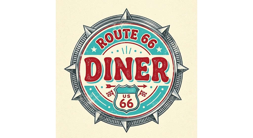
Prompt: “A 1950s American diner-style retro logo, hand-lettered rounded slab serif typography spelling ‘Route 66 Diner,’ cherry red (#C1121F) and turquoise (#40BFC1) on cream (#FFF8E7), circular badge composition with a chrome starburst border, distressed ink texture and paper grain overlay, warm nostalgic and playful mood, white background.”
This prompt commits completely to the 1950s Americana visual vocabulary — and that commitment is exactly what makes it work. The cherry red and turquoise combination is the defining color pairing of the era, used everywhere from milkshake bars to drive-in movie signs. The chrome starburst border is an authentic 1950s decorative element that immediately signals the decade without any supporting text needed. Rounded slab serif typography was the hand-lettered standard of diner signage in that period — it reads as warm, approachable, and hand-crafted. The distressed ink and paper grain overlay is critical — without it, the design looks like a digital imitation rather than a genuine vintage piece. If you want to adapt this prompt, swap “Route 66 Diner” for your own brand name and adjust the badge border to a shield or diamond shape for a slightly different 50s composition.
2. 1960s Psychedelic Concert Poster Prompt
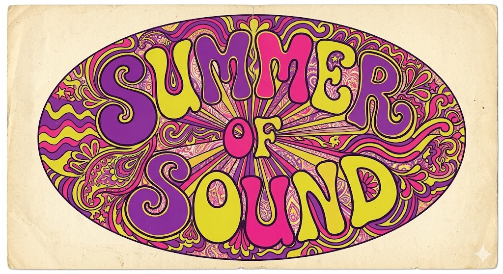
Prompt: “A 1960s psychedelic concert poster design, featuring swirling organic letterforms spelling ‘Summer of Sound,’ electric purple (#6B2D8B), acid yellow (#E8D44D), and hot pink (#E91E8C) color palette, trippy swirling background pattern with paisley and wave shapes, hand-drawn bubble letter typography, oval composition with radiating lines from center, slightly faded and worn paper texture, groovy and mind-expanding mood, cream background.”
The 1960s psychedelic poster movement — driven by artists like Wes Wilson and Victor Moscoso — had a very specific visual grammar: swirling, almost illegible typography, high-contrast complementary colors, and radiating geometric patterns that felt like visual vibration. This prompt captures those signature elements precisely. Acid yellow and electric purple sit at opposite ends of the color wheel, which is exactly the high-contrast complementary dynamic that defines psychedelic design. Specifying “oval composition with radiating lines from center” replicates the radial symmetry that was standard in San Francisco ballroom posters of that era. The faded paper texture prevents the output from looking too clean and digital. Use this prompt for festival branding, music event graphics, or any brand that wants a genuinely countercultural visual identity.
3. 1970s Groovy Earth Tone Prompt
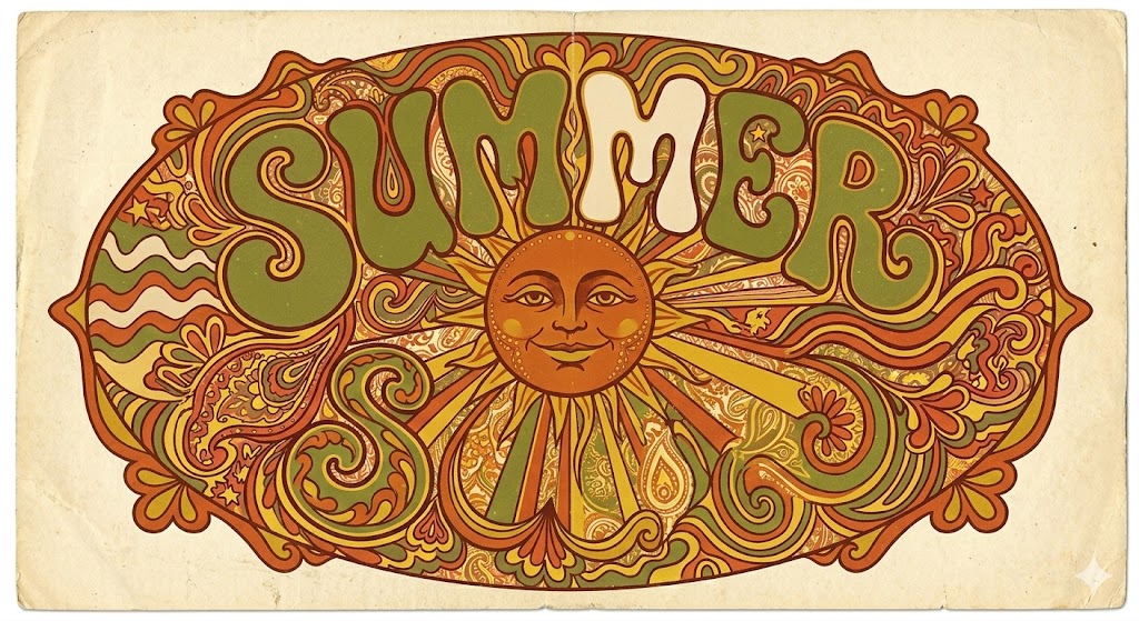
Prompt: “A 1970s groovy retro illustration, featuring a stylized sun with a smiling face, burnt orange (#C35A2A), avocado green (#6B7C3D), harvest gold (#D4A017), and warm cream (#F5EAD0) color palette, rounded groovy italic display typography, circular composition with decorative flared borders, grain texture and slightly desaturated film-era color treatment, warm nostalgic and free-spirited mood, off-white background.”
The 1970s had one of the most distinctive and cohesive visual identities of any decade in design history — and it was almost entirely defined by its color palette. Burnt orange, avocado green, and harvest gold are the three colors that immediately transport any viewer back to that era. They appeared on everything from kitchen appliances to album covers to macramé wall hangings. The smiling sun icon is a quintessential 70s symbol — friendly, organic, and slightly kitschy in exactly the right way. Rounded groovy italic display typography captures the loose, flowing lettering style of the era. The grain texture and desaturated color treatment adds the warm analog film quality that separates authentic 70s aesthetic AI outputs from generic retro design.
4. 1980s Neon Retro Prompt

Prompt: “A 1980s neon retro design, featuring bold condensed italic typography spelling ‘NIGHT DRIVE’ in chrome outline letters with neon pink glow effect, hot pink (#FF007F) and electric blue (#0066FF) neon colors on deep black (#0A0A0A) background, horizontal grid lines suggesting perspective, VHS scanline texture overlay, bold and electrifying mood, dark background composition.”
The 1980s produced one of the most recognizable visual aesthetics in design history — high contrast neon colors, perspective grids, chrome lettering, and the warm static of VHS tape. This prompt hits every major visual marker of that era. The chrome outline letters with neon glow was the signature typographic treatment of 80s movie posters, nightclub signage, and album art — think Stranger Things title card as a reference point. Hot pink and electric blue are the two defining neon colors of the decade. The perspective grid suggests the synthwave aesthetic that has seen a massive resurgence in contemporary culture. VHS scanlines add the analog imperfection that makes the output feel genuinely period-accurate. This prompt works exceptionally well for music brands, gaming businesses, and any brand targeting an audience with 80s nostalgia.
5. Art Deco 1930s Glamour Prompt

Prompt: “A 1930s art deco design, featuring a stylized female silhouette inside a stepped geometric frame, deep black (#0D0D0D), warm gold (#C9A84C), and ivory white (#FAF6EE) color palette, condensed geometric sans-serif typography, vertical symmetrical composition with sunburst fan detail at the top, clean vector line art with no texture, sophisticated and glamorous mood, white background.”
Art deco is one of the most precisely defined design movements in visual history — and its rules are strict. Geometric symmetry, stepped frames, sunburst fans, and the black-gold-ivory palette are not suggestions in art deco design — they are the foundational grammar of the style. This prompt adheres to all of them deliberately. Specifying “condensed geometric sans-serif typography” is critical because art deco typography is characterized by tight, tall letterforms with mathematical precision — not the rounded or organic styles of later decades. The female silhouette inside a stepped geometric frame references the era’s iconic poster art, particularly the glamorous travel and entertainment posters of the late 1920s and 30s. Use this prompt for luxury brands, event branding, and any project that wants to communicate sophistication with a historical visual reference.
6. Mid-Century Modern Atomic Age Prompt
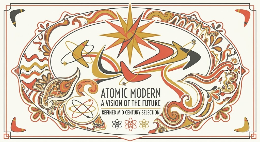
Prompt: “A mid-century modern atomic age design, featuring an abstract starburst and boomerang shape composition, coral red (#E85D4A), mustard yellow (#D4A840), and charcoal gray (#3D3D3D) on warm white (#FAFAF5), clean geometric sans-serif typography, flat illustration style with no gradients, dynamic asymmetric layout with atomic orbital ring accents, optimistic and forward-looking 1950s–60s mood, white background.”
Mid-century modern design (roughly 1945–1969) was defined by its optimism; the post-war world was embracing science, technology, and the promise of a better future, and design reflected that. Starbursts, boomerang shapes, and atomic orbital rings were the visual vocabulary of an era that genuinely believed the future was bright. Coral red and mustard yellow are the two most characteristic mid-century color accents, warm, cheerful, and energetic without being loud. The flat illustration style with zero gradients is historically accurate — mid-century design predates the airbrushed gradients of the 1970s and 80s. Asymmetric dynamic layouts were a direct visual statement against the formal symmetry of pre-war design. This prompt works beautifully for cafe branding, interior design brands, and any project that wants to channel postwar optimism.
7. Vintage Americana Road Trip Prompt
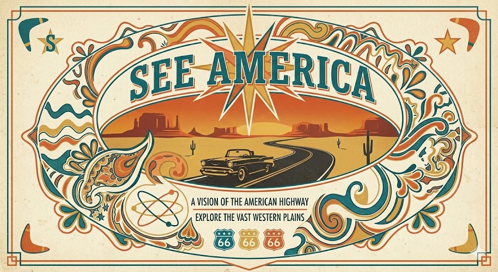
Prompt: “A vintage Americana road trip poster design, featuring a classic highway stretching to a desert horizon with a retro car silhouette, deep turquoise (#1B7A8C), warm sand (#E8C87A), and sunset orange (#D4602A) color palette, classic condensed slab serif typography spelling ‘See America,’ horizontal panoramic composition, lithograph printing texture and halftone dot grain overlay, adventurous and nostalgic mood, aged cream background.”
The Americana travel poster tradition — popularized by the Works Progress Administration (WPA) in the 1930s and 40s — has one of the most enduring visual identities in American design history. The flat color blocking, limited color palette (typically three to four colors), and bold condensed typography of WPA poster design created a visual language that still reads as powerfully nostalgic today. The halftone dot grain overlay and lithograph texture are essential inclusions in this prompt because they replicate the mechanical printing limitations of the era — and those limitations are what give the style its characteristic charm. The deep turquoise, warm sand, and sunset orange palette captures the American Southwest landscape that defined so much of mid-century road trip culture.
8. 1970s Vintage Sports Badge Prompt
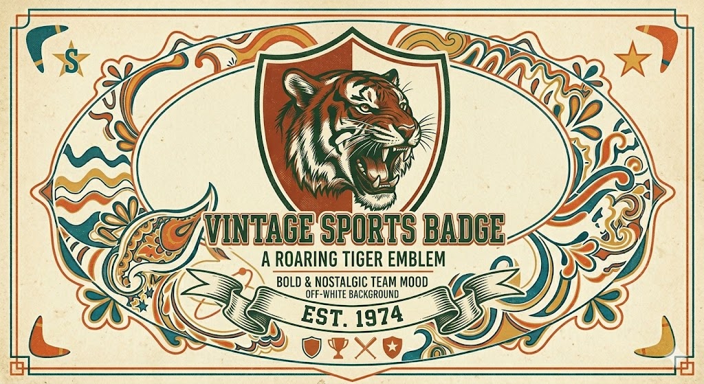
Prompt: “A 1970s vintage sports badge logo, featuring a roaring tiger head illustration inside a shield shape, burnt sienna (#8B3A20), forest green (#2D5A27), and cream (#F5EAD0) color palette, varsity hand-lettered condensed typography, shield emblem composition with decorative banner ribbon below, aged paper texture and ink bleed effect, bold and nostalgic sports team mood, off-white background.”
The sports badge aesthetic of the 1970s — think classic American football team logos, high school varsity patches, and bowling league emblems — has become one of the most copied retro design styles in contemporary branding. The shield composition with a banner ribbon below is the authentic structural format for this era of sports identity design. Burnt sienna and forest green are earthy, grounded colors that feel rugged and athletic without the high-octane neon of the 1980s sports aesthetic. The ink bleed effect — where ink appears to bleed slightly into the paper fibers — is a printing artifact of the era that adds enormous authenticity to the output. Use this prompt for sports brands, gym identities, team apparel, and any brand that wants to project heritage and competitive spirit.
9. 1960s Mod Pop Art Prompt
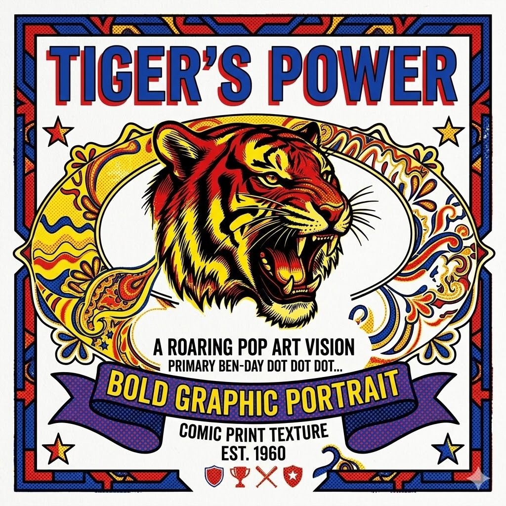
Prompt: “A 1960s mod pop art design, featuring a bold graphic portrait with thick black outlines and flat Ben-Day dot pattern fills, primary red (#D42B2B), bright yellow (#F0D000), and cobalt blue (#1A3F9E) on white, geometric bold sans-serif typography in large uppercase letters, square composition with strong graphic weight, pop art comic book printing texture, bold and ironic Pop Art mood, white background.”
Pop Art — defined by artists like Roy Lichtenstein, Andy Warhol, and Peter Blake — took the visual language of mass media, advertising, and comic books and elevated it into fine art. This prompt brings those same visual principles into Gemini AI prompt engineering. The Ben-Day dot pattern (the regular halftone dot grid used in comic book printing) is the defining texture of Lichtenstein-style pop art. The thick black outline treatment, primary color palette, and flat fills are all authentic to the movement. The key instruction here is “square composition with strong graphic weight” — pop art compositions were always bold, confrontational, and designed for immediate visual impact. This prompt works for contemporary brands that want a bold, graphic, attention-grabbing visual identity with art historical credibility.
10. Vintage Travel Poster 1930s Style Prompt

Prompt: “A 1930s vintage travel poster design, featuring a stylized Art Deco ocean liner against a geometric sunrise, midnight blue (#0D2B52), gold (#C8A951), and warm cream (#FAF6E0) color palette, WPA-style flat color illustration with no gradients, bold condensed geometric sans-serif typography spelling ‘Voyage to Paris,’ vertical poster composition with decorative border frame, aged lithograph texture and slight paper yellowing, sophisticated and romantic mood, cream background.”
The golden age of travel poster design (approximately 1920–1950) produced some of the most visually elegant printed graphics in commercial art history. Shipping companies, railway networks, and airlines commissioned stunning posters that sold destinations through idealized, geometric illustration. This prompt replicates that tradition precisely. The WPA-style flat color illustration instruction is critical — these posters used a limited palette of flat, unblended colors to work within the constraints of lithographic printing, and that limitation produced a graphic boldness that digital design rarely achieves naturally. Midnight blue and gold is the classic palette for luxury travel and transportation branding of the era. The vertical poster format with decorative border frame mirrors the physical format of the original works.
11. 1980s Retro Futurism Vaporwave Prompt
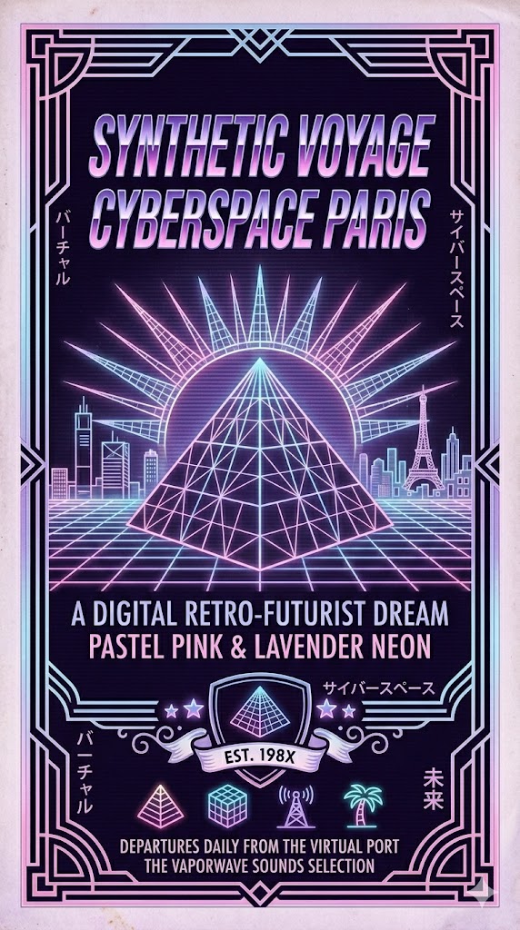
Prompt: “A 1980s retro futurism vaporwave design, featuring a geometric wireframe pyramid rising from a glowing grid plane, pastel pink (#FF6EB4), sky blue (#87CEEB), and lavender (#B39DDB) color palette, digital chrome grid lines on deep purple-black (#0D0020) background, glitchy scanline texture overlay, outrun aesthetic, Japanese katakana script accents alongside bold italic sans-serif typography, dreamlike and nostalgic-futuristic mood, dark background.”
Vaporwave is a visual aesthetic that takes 1980s retro futurism, corporate aesthetics, and early digital culture and recontextualizes them through a dreamlike, glitchy lens. It emerged as a genuine internet microculture in the early 2010s but draws all of its visual source material from the 1980s. The wireframe pyramid on a grid plane is the defining icon of the aesthetic — it references early computer graphics and the futuristic visions of the decade. Pastel pink, sky blue, and lavender are the defining vaporwave colors — softer and dreamier than the vivid neons of actual 1980s design. The inclusion of Japanese katakana script is an authentic vaporwave element that references the cultural fascination with Japanese aesthetics that permeated 1980s American consumer culture. Use this prompt for music releases, digital art projects, and brands targeting a Gen Z or millennial audience with internet culture fluency.
12. 1950s Vintage Pin-Up Illustration Prompt
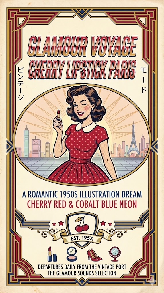
Prompt: “A 1950s vintage pin-up style illustration, featuring a stylized female figure in a polka-dot dress holding a cherry red lipstick, warm cream (#FFF5E4), cherry red (#C41E3A), and cobalt blue (#1C3F7A) color palette, classic American illustration style with clean ink linework and flat color fills, oval cameo frame composition with decorative scroll border, halftone screen print texture, playful and glamorous 1950s magazine illustration mood, cream background.”
The 1950s pin-up illustration tradition — pioneered by artists like Alberto Vargas and Gil Elvgren — combined precise academic draftsmanship with a warm, commercial sensibility that appeared everywhere from magazine pages to nose art on aircraft. This prompt captures the key visual characteristics of the style: clean ink linework, flat color fills with limited shading, the characteristic warm cream-red-blue palette, and the oval cameo framing that was standard for this type of illustration. The halftone screen print texture replicates the commercial printing process through which most of these illustrations were originally reproduced. This is a prompt that works well for vintage-inspired lifestyle brands, retro restaurant concepts, beauty brands, and any project that wants to channel 1950s Americana with a sophisticated illustration quality.
13. Vintage Record Album Cover 1970s Prompt
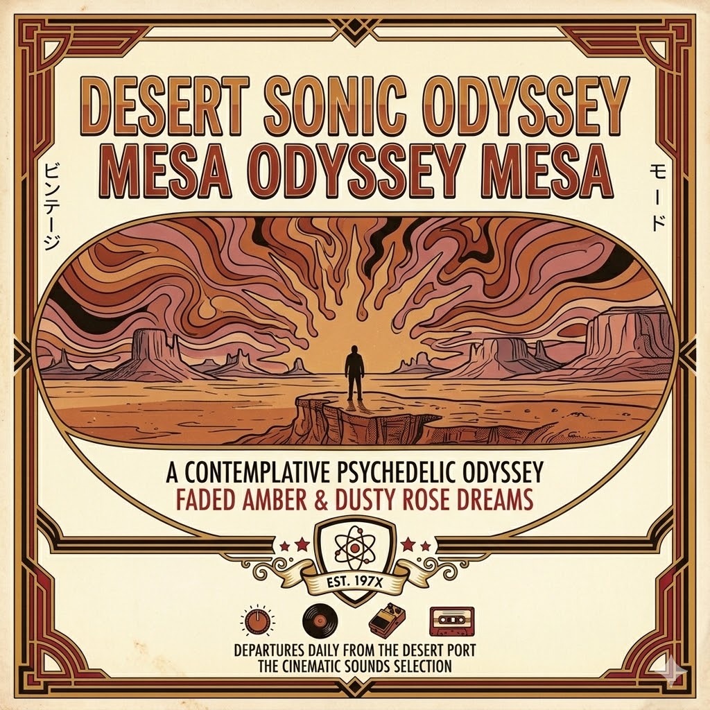
Prompt: “A 1970s vintage vinyl record album cover design, featuring an abstract psychedelic landscape with a silhouetted figure standing on a desert mesa at sunset, faded amber (#C87941), deep rust (#8B3A20), dusty rose (#C47A7A), and warm black (#1A1008) color palette, hand-drawn illustrative style with organic flowing lines, landscape panoramic composition, analog film grain and slight color fade treatment, contemplative and cinematic 1970s mood, horizontal album sleeve format.”
The album cover art of the 1970s represented perhaps the highest point of commercial illustration in popular culture — artists like Roger Dean (Yes), Hipgnosis (Pink Floyd), and countless others created visual worlds that rivaled fine art in their ambition and execution. This prompt draws from that tradition. The silhouetted figure on a landscape is a compositional archetype from 1970s progressive and folk rock album art — it creates emotional distance and a sense of journey and contemplation. The faded amber, rust, and dusty rose palette is accurate to the warm, analog color processing of 1970s photography and printing. The analog film grain treatment is the essential finishing element — it removes the clean digital edge that makes AI-generated retro design feel inauthentic. Use this prompt for music projects, lifestyle brands, and any creative project that wants to communicate depth and artistic seriousness.
14. 1940s Wartime Propaganda Poster Prompt

Prompt: “A 1940s wartime-era graphic poster design, featuring a bold silhouetted figure in profile with a raised fist, olive green (#4A5240), warm red (#B52B2B), and cream (#F5ECD7) color palette, bold condensed military slab serif typography in all caps, strong vertical composition with high graphic contrast, lithograph printing texture with ink bleed and slight paper aging, determined and powerful mood, cream background.”
The graphic design tradition of 1940s wartime posters — produced by governments, agencies, and individual artists across multiple countries — created some of the most compositionally powerful and emotionally direct printed graphics ever made. Rosie the Riveter, the “We Can Do It” poster, and countless other works from this period demonstrate a graphic boldness that came from the combination of technical printing constraints and urgent emotional intention. This prompt replicates those characteristics: high contrast between a small color palette, bold silhouette imagery, powerful condensed typography, and the physical imperfections of lithograph printing. The olive green and warm red palette is historically accurate to the era’s printing conventions and military color associations. This is a powerful prompt for brands that want to communicate strength, solidarity, and purposeful action.
15. Retro Surf Culture 1960s Prompt
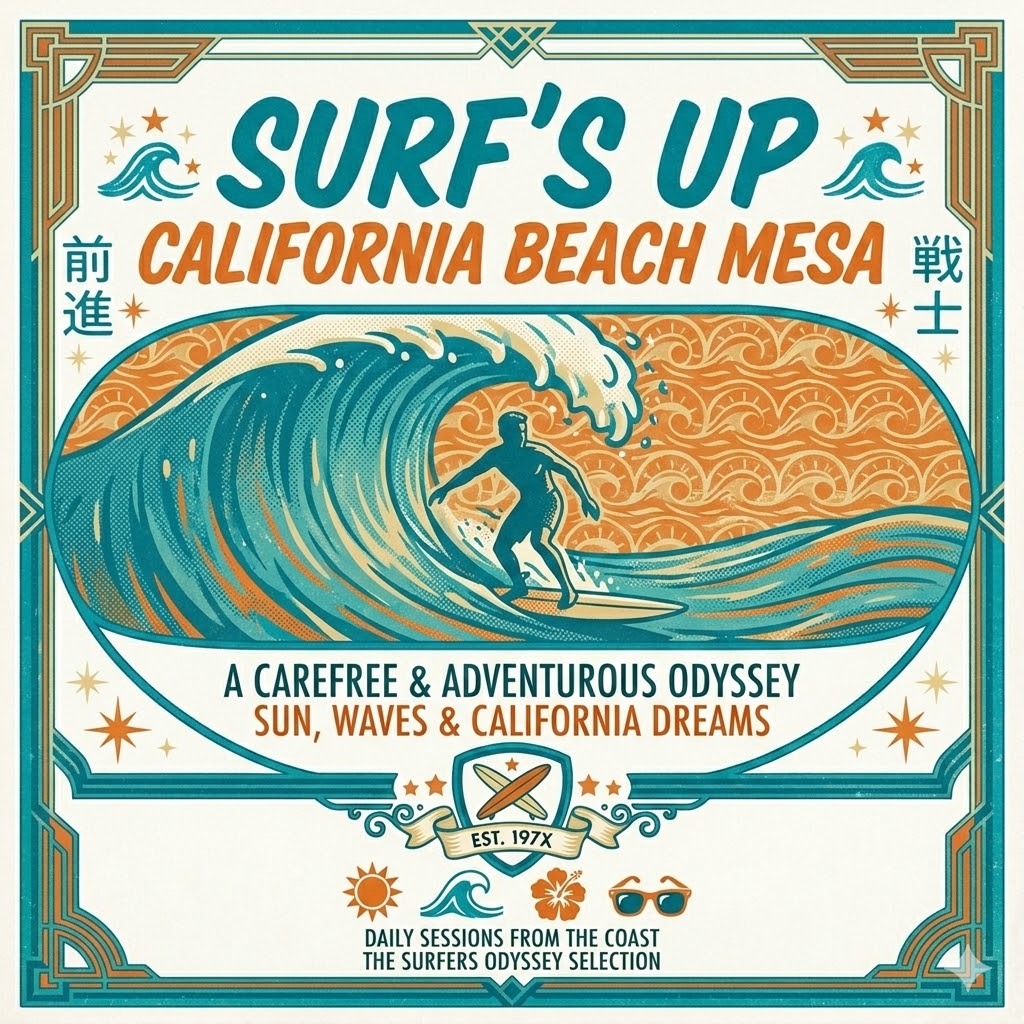
Prompt: “A 1960s vintage surf culture graphic design, featuring a stylized surfer silhouette riding a wave inside a diamond pennant shape, ocean turquoise (#00879A), sunset orange (#E8762A), and warm sand (#E8D5A0) on cream white, bold hand-lettered condensed italic typography spelling ‘Surf’s Up,’ pennant flag composition with starburst accents, screen print texture and halftone dot shading, carefree and adventurous California beach culture mood, white background.”
The surf culture visual language that emerged from California in the late 1950s and accelerated through the 1960s produced one of the most joyful and enduring design traditions in American graphic history. Brands like Hang Ten, Hobie, and the visual world of Beach Boys album art established a vocabulary built on sun, ocean, movement, and freedom. The diamond pennant composition is the authentic structural format for surf culture graphics of this era — it references the physical felt pennants that decorated bedroom walls and car antennas across California. Ocean turquoise and sunset orange is the defining color pairing of the coastal California aesthetic. The screen print texture replicates the commercial production method used for surf shop merchandise and promotional graphics. Hand-lettered condensed italic typography gives the design the kinetic, forward-moving energy of riding a wave. Use this prompt for surf and outdoor brands, beach-adjacent lifestyle businesses, and any project that wants to channel genuine California cool.
How Do You Adjust These Retro Prompts for Different Use Cases?
You adjust these retro prompts for different use cases by keeping the era-specific color palette and texture instructions intact while swapping the composition format and typography direction to match your output type. The color and texture are what create the era-accurate authenticity. The composition is what makes it work for your specific application.
Here is how to adapt each prompt type for different design outputs:
- For a logo or brand mark. Take the core color palette and typography direction from any prompt above, then add “icon-only circular badge format” or “combination mark with wordmark below icon” to the composition instruction. Simplify any complex illustrative elements into a clean, single icon. Remove any background texture instructions and replace with “white background, clean edges.”
- For a social media graphic or post. Keep the full prompt intact but add “square 1:1 aspect ratio composition” or “vertical 9:16 aspect ratio for Stories format” at the end. Social media retro graphics benefit from the full texture treatment — the grain, halftone, and aging effects read beautifully at screen resolution and stand out in a feed of clean modern design.
- For a poster or event flyer. Add “vertical A3 poster composition” or “event poster format with date and venue information area at the bottom” to any of these prompts. The 1960s concert poster prompt and the 1940s wartime poster prompt are particularly well-suited to this use case without modification.
- For product packaging or label design. Add “product label format, rectangular composition” or “circular label, fits a cylindrical bottle” to the composition instructions. The 1970s earth tone prompt and the vintage Americana prompt work especially well for artisan food and beverage packaging.
- For a T-shirt or merchandise graphic. Add “screen print graphic for T-shirt, maximum four colors, bold composition that reads well at small and large sizes” to any prompt. Remove background instructions entirely for T-shirt graphics and specify “transparent background” to get a clean print-ready output.
What Colors Define Each Retro Era for Gemini Prompts?
The colors that define each retro era are the single most powerful element in any retro-style Gemini prompt — because color is what the brain processes first, and it is what triggers the emotional memory of a specific time and place.
Here is a complete color reference for the most used retro eras in AI design:
| Era | Primary Colors | Accent Colors | Hex Code Examples |
|---|---|---|---|
| 1920s Art Deco | Black, ivory, warm gold | Deep teal, burgundy | #0D0D0D, #FAF6EE, #C9A84C |
| 1940s Wartime | Olive green, cream, warm red | Navy, brown | #4A5240, #F5ECD7, #B52B2B |
| 1950s Americana | Cherry red, turquoise, cream | Chrome silver, pink | #C1121F, #40BFC1, #FFF8E7 |
| 1960s Psychedelic | Electric purple, acid yellow, hot pink | Lime green, orange | #6B2D8B, #E8D44D, #E91E8C |
| 1960s Mod Pop | Primary red, yellow, cobalt blue | Black, white | #D42B2B, #F0D000, #1A3F9E |
| 1970s Groovy | Burnt orange, avocado, harvest gold | Brown, cream | #C35A2A, #6B7C3D, #D4A017 |
| 1980s Neon | Hot pink, electric blue, neon green | Deep black, purple | #FF007F, #0066FF, #0A0A0A |
| Vaporwave | Pastel pink, lavender, sky blue | Deep purple, teal | #FF6EB4, #B39DDB, #87CEEB |
| Mid-Century Modern | Coral, mustard, charcoal | Olive, white | #E85D4A, #D4A840, #3D3D3D |
When you pull specific hex codes from this table and include them in your Gemini prompt, the model has precise color targets to hit. This is the difference between an output that feels vaguely retro and one that feels genuinely period-accurate.
Gemini AI Retro Style vs. Other AI Tools for Vintage Design
Gemini AI compares favorably to competing tools for retro-style design in prompt flexibility and era specificity, though each platform has a different strength when it comes to vintage aesthetic output quality.
| Tool | Retro Style Strength | Weakness | Best Retro Use Case |
|---|---|---|---|
| Gemini AI | Highly responsive to era-specific descriptors, color codes, and texture instructions | Cannot export SVG; raster output only | Retro logo concepts, brand mood boards, poster ideation |
| Midjourney | Exceptional quality for illustrated retro art, painterly vintage textures | Steeper learning curve, less structured prompting | Retro poster art, vintage illustration, album cover art |
| Adobe Firefly | Commercially safe, strong halftone and texture rendering | Less creative range for highly stylized retro output | Commercially licensed retro packaging and print design |
| DALL·E 3 | Good literal interpretation of era descriptors | Tends toward illustration over graphic design | Retro editorial illustration, character design |
| Canva AI | Easy to use, accessible for non-designers | Very limited texture and aging control | Quick retro social media graphics |
For the widest range of retro design applications — from logo concepts to poster design to branding mood boards — Gemini AI offers the most accessible and flexible prompting experience among these options. The key, as with all AI design tools, is the specificity of your input. The 15 prompts in this guide give you that specificity built in from the start.
Common Mistakes to Avoid in Retro Style Gemini Prompts
The most common mistake in retro Gemini prompts is using the word “retro” without any era-specific anchors — and the second most common is forgetting to include a texture or aging effect. Both mistakes produce output that looks like a modern imitation of vintage style rather than the real thing.
Here are the specific mistakes to avoid and what to do instead:
- Saying “retro” with no era specified. Replace “retro style” with the specific decade or movement: “1970s groovy,” “1950s Americana,” “art deco 1930s,” “1980s neon.” Every time you name the decade, Gemini’s output sharpens significantly.
- Skipping the texture instruction. Clean, smooth digital output is the opposite of retro. Always include at least one texture element — “halftone grain overlay,” “distressed ink texture,” “aged paper yellowing,” “screen print texture,” “lithograph printing effect,” “analog film grain.” This single addition transforms the output from modern-looking to genuinely vintage-feeling.
- Using modern sans-serif typography defaults. Gemini defaults to clean modern sans-serif type if you do not specify otherwise. For retro prompts, always name the typographic style explicitly — “rounded slab serif,” “condensed italic display,” “hand-lettered bubble letters,” “geometric condensed caps,” “varsity hand-lettered.” Typography is one of the most era-specific design elements and Gemini responds well to precise instructions.
- Using too many colors from different eras. Mixing neon pink from the 1980s with harvest gold from the 1970s and cobalt blue from the 1960s produces something that reads as generically colorful rather than era-specific. Stick to the color palette of a single decade from the reference table above.
- Forgetting the background instruction. Without a specified background, Gemini sometimes places retro designs on complex gradient or photographic backgrounds. Always specify “cream background,” “aged paper background,” “white background,” or “dark background” depending on your era and output needs.
Conclusion
Retro design works in Gemini AI when you treat every prompt like a time machine — you need to know exactly which era you are going to, exactly what colors and textures defined that visual world, and exactly which typographic and compositional conventions belong to it. Vague prompts get you generic results. Specific, era-anchored prompts get you something genuinely evocative and usable.
You now have 15 complete, production-ready prompts covering the most powerful retro eras — from 1920s art deco glamour to 1980s neon vaporwave — each with a full explanation of the design logic behind it. You also have the color reference tables, the era comparison guide, the use-case adaptation instructions, and the mistake list to help you refine your approach as you iterate.
Open Gemini now, pick the retro era that fits your project, copy the prompt, swap in your brand name and any specific color adjustments, and start generating. The best retro design you will ever create starts with the right prompt — and now you have 15 of them.
Frequently Asked Questions
Can Gemini AI accurately replicate a specific decade’s visual style?
Yes, Gemini can produce highly era-accurate output when your prompt names the decade explicitly and includes the correct color palette, typography style, and at least one authentic texture effect. The more specific your era anchors — colors, textures, composition format — the more historically accurate the result.
Do you need to know design history to write good retro prompts for Gemini?
No, you do not need a formal design background. The prompts, color tables, and era reference guide in this article give you everything you need to write effective retro prompts without any prior design history knowledge. Use the tables as your starting reference and build from there.
Which retro era is easiest to generate with Gemini AI?
Yes, the 1970s groovy earth tone aesthetic and 1950s Americana style tend to produce the most consistent and visually coherent outputs in Gemini because their color palettes are distinctive and their visual vocabulary is well-represented in the model’s training data. Both are excellent starting points if you are new to retro AI prompting.
Can Gemini generate retro designs with transparent backgrounds?
Yes, add “transparent background” to any prompt in this guide and Gemini will attempt to remove the background from the output. For guaranteed transparency, run the PNG output through a background removal tool like Adobe Express or remove.bg — this ensures a clean, usable edge for any application.
Can these retro prompts be used for commercial branding projects?
Yes, these prompts are specifically written for commercial applications — logos, packaging, event branding, merchandise, and social media graphics. Always verify Google’s current Gemini terms of service for commercial use rights before applying any AI-generated output to a paid client project or commercial product.
Is Gemini better than Midjourney for retro style design?
No, Midjourney generally produces superior painterly quality for illustrative retro styles — particularly for vintage poster art and album cover aesthetics. However, Gemini is more accessible, easier to prompt with structured text instructions, and better suited for designers who need logo concepts and brand identity outputs rather than fine-art-quality illustration. Both have a legitimate place in a retro design workflow.
How do you make Gemini AI retro designs look less digital and more authentic?
Yes, the key is always in the texture instructions. Add “halftone grain overlay,” “analog film grain,” “screen print texture,” “aged paper yellowing,” “distressed ink bleed effect,” or “lithograph printing texture” to any retro prompt. These texture descriptors are the single most effective instructions for making AI-generated retro output feel genuinely vintage rather than digitally imitated.
You May Also Like
 AI Prompts
20 Funny Things to Ask ChatGPT When You Need a Study Break
 AI Prompts
30 ChatGPT Prompts for Business Ideas: How You Can Find an Idea Worth Building
 AI Prompts
50 Best ChatGPT Prompts for Marketing When You Want Better Ideas, Faster Drafts, and Less Guesswork
 AI Prompts
30 Funny ChatGPT Prompts to Try When You Want to Laugh, Kill Boredom, and Have More Fun
 ChatGPT
How to Write Effective Prompts for ChatGPT
 AI Prompts